 KSDK St. Louis is the latest Gannett station to streamline its on-air news presentation, unveiling its new look today. “It’s simple, it’s clean and it’s very, very easy to read. But in the same breath … it has more information,” says Gannett Broadcasting's Rob Mennie. Gannett says it will have made the changes at all 23 of its stations by the end of the first quarter.
Gannett Stations Clean Up Their Graphics
KSDK St. Louis today will become the fifth Gannett station to start airing a new graphics package designed to give its newscasts a cleaner look while boosting editorial content.
“We made this change for editorial advancement as opposed to just a better looking graphics package,” says Gannett Broadcasting VP-Senior News Executive Rob Mennie. “It’s simple, it’s clean and it’s very, very easy to read. But in the same breath … it has more information.”
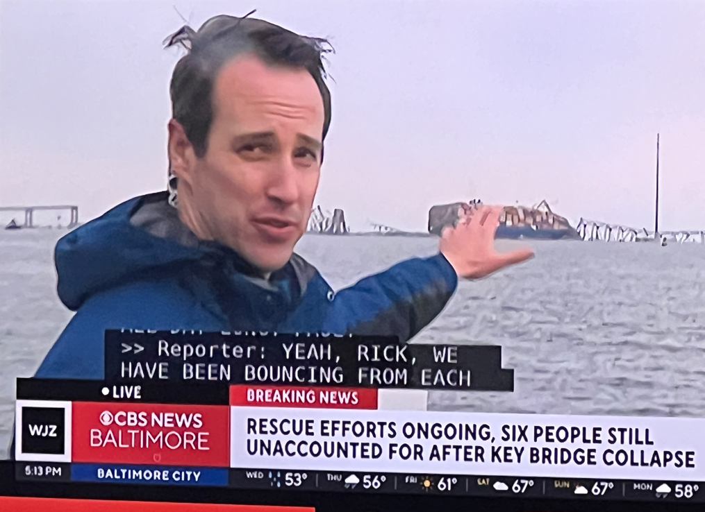
Gannett debuted the new graphics — three simple horizontal lines at the bottom of the screen — on WTSP Tampa-St. Petersburg- Sarasota, Fla., and WFMY Greensboro-High Point-Winston Salem, N.C., in December.
The simpler look — which the company plans to have on all 23 of its stations by the end of the first quarter — replaces its previous package, which “just had stuff all over the screen,” Mennie says.
The new graphics includes three lines in the bottom third of the screen, the first of which is reserved for short story summaries. Right under that, stations are able to list the next three stories coming up on a newscast. The bottom third of the package is designed for a news ticker, which individual stations have the option to run or not, Mennie says.
Being able to use more characters within those graphics, for example, means stations will now be able to run short story summaries versus simply titles like they have been doing.
In addition, stories will be color-coded by topic, in the same way that Gannett-owned USA Today does to identify its content by category, Mennie says.
Graphics accompanying a news story, for instance, will be highlighted in blue, just as money stories will be in highlighted in green and sports stories in red. Lifestyle stories are showcased with purple.
According to Mennie, Gannett is redoing its appearance in response to consumer complaints that TV news screens are just too muddled, often with so much information that they are more confusing than helpful.
Gannett screens were just as cluttered as any. Upcoming stories were teased on the sides of the screens, and title bars ran along the bottoms. Buttons would appear in other spots.
“It was even more than a little crowded,” Mennie says. “Viewers didn’t know where to look.”
Mennie likens Gannett’s new user-friendly look — and therefore experience — to something consumers are more likely to find on tablet computers than TV screens.
“If you go to a really good app, it just makes sense. It is just easy and it flows,” he says. “We wanted to do the same thing with this. We want to make sure understanding [how to navigate TV newscast screens] is almost second nature.”
The Mill, a New York and Los Angeles-based image and design firm that specializes in user interfaces and experiences, created the new package, Mennie says.
Gannett is also trying to reach news viewers through the addition of new music, an effort that is unrolling in conjunction with the new on-air look.
A newly composed “anthem,” called This is Home, is now available for news teams to incorporate in a number of ways, Mennie says. The song can be used in story telling, promotion or station events. KUSA Denver, for example, ran the music as part of a story previewing last weekend’s Broncos playoff game.
Composed by Gari Music, there are three different version of the song so that it fits the mood of particular stories, he says. The concept is far different than typical newscast themes, which focus more on the news operations themselves than the people they serve, Mennie says: “Music can create emotion as opposed to being about us.”
While the addition of new graphics and new music may seem like two very separate — and pretty subtle — changes, Mennie says he believes that together the modifications will make an impact on KSDK’s viewers.
“There are a lot of intangibles to this, “ he says. “But by simplifying your message, making it easier to understand and digest, while at the same time celebrating the community you live in, you can take on a whole different look and feel to local news.”
Read other Air Check columns here. You can send suggestions for future Air Checks to Diana Marszalek at [email protected].













Comments (9)
Angie McClimon says:
January 15, 2013 at 11:46 am
KARE in Minneapolis will be the last to switch. They fought off the last image change for a while before succumbing to it. The Gannett music package was never used, keeping with their tired “We Know What Matters” theme.
brooks chretien says:
January 15, 2013 at 1:05 pm
Yup, looks good BUT the graphic is so tall it covers players on basketball highlights, and the local shooters need to back of the faces to make room as well. Never understood why they shoot so close anyway! BONUS is that the upcoming story list doesn’t fall off the right side of my screen now!
Roger Lyons says:
January 15, 2013 at 1:29 pm
Now, the Scripps Television Group has to reverse its change to “busy” graphics that mimics CNN a bit that they switched to this past fall. The moving Facebook/Twitter information is annoying.
Jeremy Montoya says:
January 15, 2013 at 4:02 pm
Um, those are KUSA’s graphics and not KSDK’s
Diane Tryneski says:
January 15, 2013 at 4:59 pm
Doesn’t matter. They’re both the same.
Shenee Howard says:
January 15, 2013 at 4:42 pm
Gannett basically ruined the Pyburn graphics that looked so good on WNBC and translated so poorly to KSDK. I hope they also ditch the set, and go simpler like the Tampa Gannett station. It is too red, too busy. Now if only they can improve the actual news product……
Dale Godfrey says:
January 15, 2013 at 8:38 pm
Well, if Gannett HQ has come up with something, it is bound to be better than those I used to have to slog thru when I flipped on KUSA in Denver! Gawd, with all the rundowns, crap covering the screen, I thought perhaps Gannett had sold out to Fox Sports! But wait, what ever happened to hiring the right people to make the right decisions for their MARKET, rather than putting one shoe out there for 23 different feet to fit? Cost savings, I would hope, because there sure as hell aren’t no ‘Hq Types” that’re smarter than ALL the field GM’s.
Jessica Kates says:
June 17, 2013 at 1:30 am
If Gannett is trying to reach news viewers through the addition of new music, an effort that is unrolling in conjunction with the new on-air look, they just basically ruined the Atlanta market. Atlanta is a way more Cosmopolitan city, and this newly composed “anthem,” called This is Home, just doesn’t fit in here. Atlanta is no small town and needs a more energetic, almost want to say international “anthem” than a lame anthem like ‘This is Home tone…to layed back for Hot Atlanta… Gannett are you listening to your news viewers? I’m one of many and we don’t like it!
Rosaria says:
August 21, 2018 at 2:12 pm
I spent a lot of time to locate something such as this